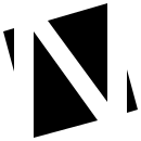
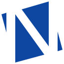
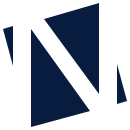
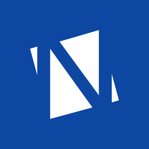
The norcane mark is not a letter N. It is a square with an N cut out of it in three strokes. That square and that angle are the whole identity: they show up in status dots, in charts, in photo frames, in the edge of every banner, and in the terminal.
The construction is exact and can be repeated by hand at any time: a square of side 100, rotated 15° counter-clockwise. Into it, three cuts, each 18 units wide. Two vertical, symmetric at 43 units from the centre, and one diagonal at 36° from vertical, joining the top of the left cut to the bottom of the right one. What remains is the mark.
The original file was lost. This vector was traced from the 130 px raster and deviates from it by at most one pixel. It is the source of truth: norcane-mark.svg.
Leave one cut's width of space around the mark, 18 of 130. The smallest size is 16 px, where the cuts merge into letter strokes and the mark reads as an N, which is fine.
Any angle other than 15°, any other aspect ratio, a gold mark, a shadow or an outline. Gold is for actions and light in interfaces; the mark stays blue, white or ink.
The wordmark is Archivo at 118 % width with 0.32 em tracking, capitals, always in norcane blue or white. Products are named with one lowercase word at 92 % width and no tracking. The difference in width is the whole rule: wide is the brand, narrow is the product.
A product has no mark of its own. The norcane mark plus one word is its entire identity, so every new project looks like a sibling and not a stranger. The gap between mark and word is half the mark's height.
This is the core of the identity. Wherever an interface or a document would use a circle, a dot, a ring or a square end, norcane uses a square rotated 15°. Never 45°: that is a diamond and everyone has one. Fifteen degrees belongs to norcane. And never below 10 px: smaller than that the eye reads the angle as a mistake, so tiny markers are plain text, not tiny squares.
Lists have no bullets: a hanging indent and a rule between items do the work. The square appears only to single out one item, at its full 10 px, in gold.
A filled square is a state with evidence, a hollow square is a state without. The word is always next to it; colour never carries the information alone.
One square in the middle of a rule separates parts of a document. The same square at the start of a line marks a chapter.
Bars have ends skewed by 15°, not rounded, so their sides run parallel to the sides of the rotated square. Blue is capacity or progress, gold is what you are looking at right now.
Photos and avatars are cropped to the rotated square with the same coordinates as the mark. The image inside stays level; only the mask turns.
The square makes a full turn and stops at 15° again. With reduced motion it stands still and simply appears.
The active tab is marked by a square under the text, not an underline. The same square marks the current page in navigation.
One card per screen. The corner is the only place where the square steps outside the element's boundary.
The primary button is gold with ink, one per screen. No glyph before the text: the colour is the emphasis.
A grid of squares rotated 15° on norcane blue, white at 14 % opacity. For banner backgrounds, card backs and print. Never under text.
Data points are rotated squares; the latest value is gold and labelled. Lines are 2 px, the grid is dotted and quiet, one axis only. Text is always ink; the series colour stays on the point.
Norcane blue #0D47A1 comes from the original avatar and is the only colour the mark may have besides white and ink. It is a pure blue at hue 260° with high chroma, which is why it survived review. Gold sits at 84°, 176° away from the blue, an almost exact complement. Every neutral is derived at the same hue 260° as the brand blue, and every text colour reaches at least 4.5 : 1 on its surface.
#0D47A1Mark, primary surfaces, data series#2F6BD1Links, charts on dark surfaces#071630Dark-mode background, ink on gold#081C3FText on paper, one-colour print#D9A62EPrimary button, highlight#F1C862Focus ring and gold text on dark#916900Gold text on light#F4F6FCLight-mode background and documentsThe ratio is 70 / 25 / 5. In dark mode paper and night swap places; blue and gold stay.
Green, orange, red and grey carry state, never the brand. Gold never means warning, and so that this holds even without the word, orange sits at hue 45° and is darker than gold text. Every state also has a shape and a word.
Archivo is variable in both width and weight, so it carries the whole identity by itself: wide for the wordmark, slightly narrow for headlines, normal for text. It has tabular figures, which interfaces need. JetBrains Mono is only for code, logs, versions and technical labels.
Etalon checked 214 plans, 9 disagree with the standard.
Headlines are weight 700 at 94 % width with negative tracking. Body text is weight 400 at 100 % width with a line length around 65 characters. Labels are 13 px, weight 500, and never in capitals; capitals belong to the wordmark alone.
The large square always runs off the surface, so only its edge at 15° is visible. That is the one piece of decoration the identity has, and every banner, social card and title slide carries it.
Organisation avatar: white mark on blue, no word. The wordmark sits next to it in the profile.
$ headroom run
◆ headroom 0.5.0 · powered by norcane
◆ loading configuration .headroom.yaml
◆ 212 files, 9 without a header
◆ done in 0.8 s
A showcase, not a component library: the handful of controls every norcane interface has, each with the one rule that makes it norcane. All of them are native elements styled with CSS, so keyboards and screen readers work without any script. The base rules ship in tokens.css.
Quiet border in the line colour, gold focus ring, label above. An invalid field turns its border red and says what to do next.
Both are rotated squares. Checked is filled, unchecked is hollow, the same logic as status dots. A radio shows a smaller square inside instead of a dot.
The track is skewed like the meters, the knob is the rotated square, and because both follow the mark's own sides, their edges agree. The track turns blue when on. Motion is a short slide, none under reduced motion.
A select keeps a chevron, because an arrow says “open me” and a square does not. A combobox is a text input with a list underneath; the highlighted option carries a filled square, the others hollow.
One gold primary per screen. Secondary is an outline in ink, destructive is red text on a red tint, disabled keeps its shape and drops to 45 % opacity.
| Service | State | Memory | Uptime |
|---|---|---|---|
| Etalon demo | Running | 612 MiB | 14 d |
| Na co koukat | Maintenance | 1 204 MiB | 3 min |
| Lookout | No record | – | – |
Numbers right-aligned in tabular figures, units after values, the highlighted row marked by a gold square at its left edge. No zebra stripes.
A square leads the message; blue for information, red for errors. The first line says what happened, the second what to do. No exclamation marks.
The site switches to 20260913-1620. Nothing is deleted.
The title is a question, the primary button answers it in the same words. A dialog uses the native element and closes on Escape.
A tooltip is a parallelogram with the brand skew and no pointer: it sits tight under its trigger, one line only. Tags are quiet outlines; a selected tag gets the square.
Norcane makes tools for people who want to get things done. The writing behaves accordingly.
A button says what happens. "Download the mark", not "Submit". The message after the action uses the same word.
Unit after the value, tabular figures, no rounding that would lie. Czech interfaces use the decimal comma; English ones the point.
"The snapshot is older than a minute, the agent is not reporting" instead of "Something went wrong". No apologies, no exclamation marks.
KZP, TKP, ČSN, VPS and TLS stay as abbreviations. Code, identifiers and comments are in English; user-facing text is in the user's language.
Every file here is the same geometry. Use the SVGs wherever you can; the PNGs are for places that insist on raster.
The light set. Dark mode swaps paper for night and ink for white; blue and gold stay. The full file with both sets is tokens.css.
:root {
  --paper: #F4F6FC;  --paper-2: #FFFFFF;  --ink: #081C3F;  --ink-2: #314E7C;  --ink-3: #62709A;
  --night: #071630;
  --blue:  #0D47A1;  --blue-2: #2F6BD1;
  --gold:  #D9A62E;  --gold-soft: #F1C862;  --gold-text: #916900;
  --good:  #0D814C;  --warn: #BA5217;  --crit: #C72E38;  --none: #637092;
  --angle: -15deg;                      /* rotation of the square */
  --skew:  15deg;                       /* skew of bars and panels */
  --font-ui:   "Archivo", "Helvetica Neue", Arial, sans-serif;
  --font-mono: "JetBrains Mono", ui-monospace, monospace;
}
.sq { width: .55em; height: .55em; background: var(--blue); transform: rotate(var(--angle)); }
.frame { clip-path: polygon(2.3% 22.3%, 76.2% 2.3%, 97.7% 77.7%, 23.8% 97.7%); }
.meter { transform: skewX(var(--skew)); }